Why it is written this way
Thumbnails generated by AI often look stunning on a large monitor but become a blurry mess once uploaded. The main reason is visual clutter. On a mobile feed, your thumbnail competes side-by-side with dozens of videos at thumbnail size. Looking detailed on a desktop screen and standing out in a crowded feed are two completely different things.
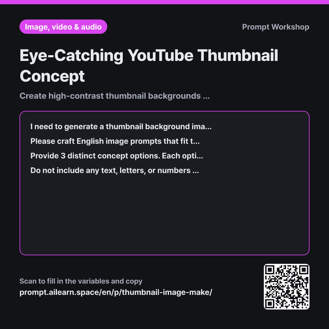
This is why the first paragraph's context explicitly includes "viewed as a tiny thumbnail on mobile screens" and "I will add text later." Without these instructions, the AI fills the canvas edge-to-edge like an intricate poster, cluttering the space needed for readable text—the most common pitfall in AI thumbnail creation.
The task section limits elements to three or fewer and places the main subject first. Text-to-image models assign heavier weight to earlier tokens, so putting the focal point upfront ensures a bold, recognizable silhouette that survives downsizing. Specifying the text placement in the format streamlines your editing workflow; an image is useless if there is no clean negative space for typography.
The constraints eliminate elements that fail on small displays. Intricate patterns become gray noise, and low-contrast palettes merge together into an unrecognizable blob. Asking the model not to render text also guarantees higher production value, since AI-generated lettering is usually misspelled and messy compared to dedicated design tools.
Unfamiliar terms? See Aha AI: prompt, output-format
Compared with a bad example
Make a thumbnail for a fridge organization video. Make it super eye-catching and put the title in big letters.
Asking the AI to add text produces garbled, unreadable lettering right in the center. Without constraints on element count or contrast, the image gets overloaded with refrigerators, produce, bins, and hands all at once. When shrunk down, the viewer cannot tell what the video is about, forcing you to crop or obscure half the artwork in post-editing.
Variations
When Adding a Cutout Face on the Right
I am creating a thumbnail background for a video about "{{video topic}}". I will place a cut-out photo of my face on the right third of the frame, so that area must remain clean, simple negative space. Concentrate the primary focal elements in the left two-thirds, using colors that reflect a {{channel vibe}} tone. Provide 3 English image prompts. Below each option, include a one-line note confirming whether the color palette will avoid clashing with a portrait cutout.
Reserving dedicated negative space for a portrait cutout speeds up your editing process significantly.
Consistent Branding for a Video Series
I am establishing a repeatable thumbnail format for an ongoing video series about "{{video topic}}". First, establish a set of core design rules that fit a {{channel vibe}} tone. Define four visual parameters: background color palette, main subject placement, lighting direction, and negative space allocation. Then, provide a single-line English image prompt for this episode that strictly adheres to these rules. Finish by listing which elements can change in future episodes versus which elements must remain fixed.
For serialized content, consistent visual branding matters more than novelty. Standardizing the structural framework lets you quickly swap out the main subject for every new upload.
Model notes
Request a 16:9 landscape aspect ratio across most image generation tools. Add typography using graphic design software rather than the AI generator to avoid distorted text.
Related prompts
Last updated 2026-09-02 · Found a mistake? Let us know