Why it is written this way
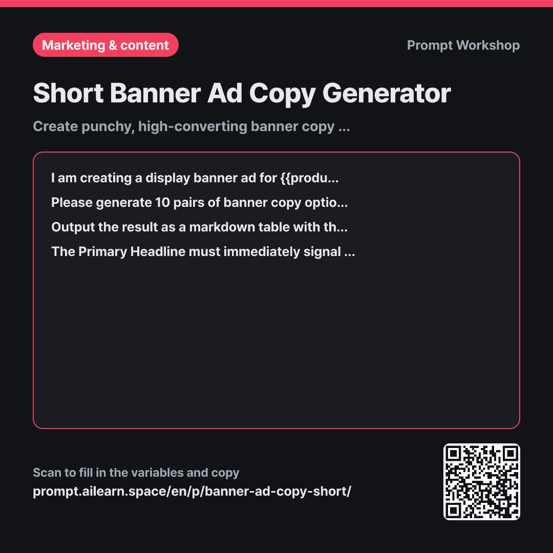
When you ask an AI for banner copy, it usually produces full, descriptive marketing paragraphs. Handing those over to a designer leads to requests to cut the text down, resulting in awkward fragments. Short, punchy ad copy shouldn't be chopped down from long sentences; it needs to be written short from the start.
The first paragraph establishes the real-world context of display ads: people only glance at banners for less than a second. This framing keeps the AI from trying to over-explain and forces it to focus on impactful phrases.
In the Task paragraph, specifying "clusters, not sentences" and splitting the copy into Primary and Secondary lines is crucial. Banner designs use two distinct typographic hierarchy levels, so generating both lines together allows them to drop directly into a layout. The "Angle Focus" column in the Format table helps you quickly compare diverse creative directions. Without this directive, the AI often repeats the exact same discount angle across all 10 options.
The Constraints prevent the most common display ad pitfalls: headlines that don't make sense alone, or hallucinated promo dates and discount amounts. Once you get the table, pick your favorite option and follow up with "Give me 5 more variations of #3" to quickly refine the winner.
Unfamiliar terms? See Aha AI: output-format, prompt
Compared with a bad example
Write some short copy for a banner ad about grocery delivery.
This prompt will produce generic, long-winded sentences like "Get your farm-fresh vegetables delivered straight to your door tomorrow morning." These won't fit inside a banner layout without shrinking the font to an unreadable size. Without explicit offer details or a two-tiered headline structure, designers are forced to manually rewrite and reformat everything.
Variations
Refining a selected winning angle
I like Primary Headline #3 from your previous output. Please generate 5 more variations exploring that exact direction. Make the Primary Headline even tighter (max 3 words) and ensure the specific numbers from {{benefit advantage details}} stand out clearly in the Secondary Tagline. Add a short note next to each option highlighting how it differs from #3.
Once you have chosen a winning creative angle, you only need to refine the tone and phrasing. Shortening the headline further leaves more visual room for bold typography.
Single-line ribbon banner
Please write 8 single-line copy variations for a horizontal ribbon/leaderboard banner for {{product item}}. Because vertical space is strictly limited, everything must fit on one line. Each line must communicate both the product and the {{benefit advantage details}} within 8 words. Pair each option with a concise CTA button text (under 3 words).
Ribbon banners cannot accommodate a two-tier layout, so all essential info must be condensed into a single line. Including the CTA button copy alongside the main message gives you a complete, ready-to-use asset.
Related prompts
Last updated 2026-09-02 · Found a mistake? Let us know