Why it is written this way
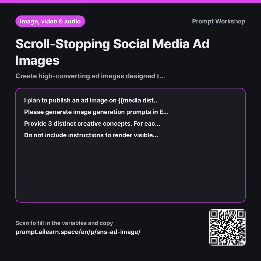
The most frequent mistake when using AI for social ad visuals is asking the model to render typography directly onto the image. Image generation models treat letters as graphic shapes, resulting in illegible, mangled text. Since typography is best added in graphic design tools, the primary goal of the prompt is reserving clean negative space for that copy.
Specifying the channel and audience in the Context section ensures the scene fits consumption habits. A story format demands a tall vertical layout for fast swiping, whereas a blog banner is wide and viewed longer. Stating that viewers "decide whether to stop within one second" instructs the AI to favor clean, uncluttered visual hierarchy. Without this boundary, models tend to produce overly busy images where key elements get lost on mobile screens.
The Task section enforces a strict ordering rule. Placing the subject first, followed by lighting and stylistic cues, keeps the core product focal. Transforming benefits into visible scenes is essential: abstract phrases like "great cost performance" cannot be visualized, but "placed seamlessly on a compact studio kitchen counter" produces an instant visual anchor.
The Format section requests three distinct creative directions and explicitly maps out where negative space sits. Producing high-performing ad creatives requires comparing alternatives and iterating on specific descriptors. Having predefined copy placement coordinates speeds up the transition to graphic layout tools, ensuring seamless integration between AI imagery and typography.
Unfamiliar terms? See Aha AI: output-format, prompt
Compared with a bad example
Make an image prompt for an induction cooktop ad on Instagram with the text "Perfect 3-burner induction cooktop for small apartments" written on it.
Requesting text directly inside the image causes garbled, unusable lettering. Lacking composition and lighting parameters, the product often fills the entire canvas with zero negative space for copy overlays. Providing only a single concept leaves no basis for comparison or refinement.
Variations
When the Selected Concept Lacks Visual Impact
I chose one of the concepts above, but I am concerned it will not stand out enough to {{target audience persona}} in their feed. Without rewriting the entire prompt from scratch, provide 3 modified variations adjusting only visual hook elements (such as color contrast, dramatic lighting, subject scale, or background simplicity). Below each option, add a one-line note explaining what changed and why.
Rewriting the entire prompt risks losing what worked in the original draft. Constraining the revision to four specific visual levers ensures controlled, methodical iteration.
Adapting One Concept Across Multiple Channels
I want to adapt the ad image for {{product or service to promote}} across multiple platforms beyond {{media distribution channel}}. Write separate English image prompts for the same visual concept tailored to vertical (9:16), square (1:1), and wide horizontal (16:9) aspect ratios. Adjust only the composition, subject framing, and negative space placement to fit each layout, keeping the core visual elements identical. Add a one-line note for each format indicating where to position the ad copy.
Generating entirely new prompts per channel fragments brand consistency. Modifying only framing and negative space maintains a cohesive cross-channel campaign look.
Model notes
Aspect ratio syntax varies across image generation tools. Some use inline command parameters (such as `--ar 1:1`), while others use interface presets. Adjust the layout references in the generated prompt according to your specific platform's formatting.
Related prompts
Last updated 2026-09-02 · Found a mistake? Let us know