Why it is written this way
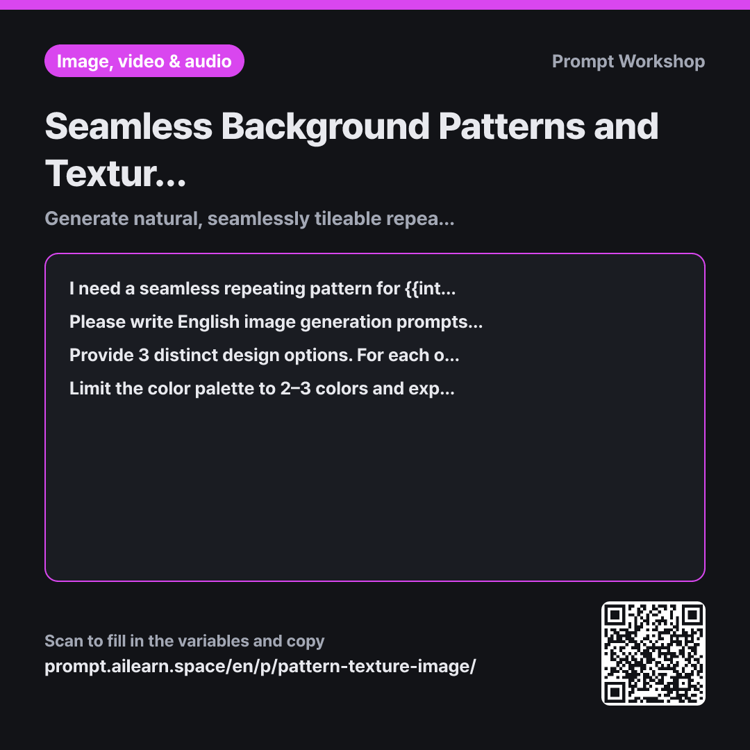
It is common for an AI-generated pattern to look beautiful as a standalone image, only to reveal obvious square grid lines once repeated across wrapping paper. This happens because the AI was not instructed to make it tileable—it generated a single illustration where motifs abruptly cut off at the edges. The opening paragraph prevents this issue.
Task: Specifying the sequence of descriptors is crucial because patterns are structured differently from illustrations. While illustrations prioritize the subject, patterns depend heavily on spatial arrangement. For example, aligned wheat stalks look neat and formal, while a staggered layout feels organic. Eliminating shadows and perspective is equally important; any illusion of depth or directional lighting creates glaring lighting mismatches once tiled.
Format: Requesting three options alongside density keywords allows for easy fine-tuning. Pattern density can drastically change the mood, and having specific swap words ready lets you tweak the layout without rewriting the entire prompt from scratch.
Constraints: Restricting the palette to 2–3 colors and motifs to 3–4 items addresses practical print and digital display constraints. Most cluttered repeating patterns fail because too many elements were packed into a single tile. Specifying the background color ensures sufficient contrast for overlaying text later. When printing, fewer colors ensure predictable, clean output; on screens, subtle patterns keep foreground content legible.
Unfamiliar terms? See Aha AI: output-format, prompt
Compared with a bad example
Create a cute bread pattern image for bakery packaging
A vague request like this results in a single image with randomly scattered bread illustrations. While the center might look fine, items near the border will be cut in half, creating jarring seam lines when tiled. It also tends to generate chaotic palettes with dozens of uncontrolled colors, making it impractical for packaging.
Variations
When you need a paper or fabric texture instead of a pattern
I need a subtle surface texture to use as a background for {{intended_use}}. Instead of distinct graphic motifs, it should be a close-up surface texture such as paper, linen, or wall plaster. The aesthetic should align with "{{pattern_vibe}}". The texture must be seamlessly tileable in all directions. Keep contrast low and subtle so text placed over it remains easily legible. Provide 3 English prompt variations with a one-line explanation of their differences.
Unlike graphic patterns, background textures should remain subtle. This variant emphasizes low contrast and suitability for text overlays.
When adjusting only the color scheme of a chosen concept
I have selected one of the pattern concepts. Keeping the motifs, layout, and art style identical, create 3 color variations: one with a dark background, one reduced to a minimal two-tone palette, and one alternative palette tailored for {{intended_use}}. List the updated English prompts and note which color keywords were changed.
Once you like the layout, you can easily produce multiple seasonal or themed variations simply by swapping the color parameters.
Model notes
Some generative tools feature native seamless tiling toggles (such as Midjourney's `--tile`), while others rely entirely on text prompting and may occasionally produce minor edge artifacts. Always test your generated image by assembling a 2x2 grid before sending it to production.
Related prompts
Last updated 2026-09-02 · Found a mistake? Let us know