Why it is written this way
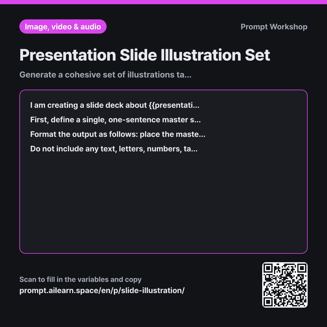
When generating presentation images slide by slide without a system, one slide ends up in watercolor while the next turns out as a glossy 3D render. Audiences interpret these accidental stylistic shifts as meaningful differences in content. The core principle of this prompt is locking down a shared stylistic rule before generating a single visual.
In the Context section, specifying that "a unified set is more important than individual aesthetics" is vital. Without this constraint, the AI chooses whatever style best fits that isolated scene. Defining the deck's topic and visual identity upfront establishes a firm baseline.
In the Task section, the workflow is split into two distinct stages: creating the master style sentence first, and then appending scene descriptions to it verbatim. If written manually from scratch each time, slight word variations introduce noticeable stylistic drift. Locking the formula ensures you can reuse the exact style rule later if more slides are added. Limiting the initial batch to 5 scenes is deliberate: most slide decks rely on standard thematic slots—problem, root cause, solution, case study, and takeaway—so preparing 5 core assets in advance eliminates mid-deck generation bottlenecks.
In the Format and Constraints sections, isolating the master style line at the top makes it easy to swap in new scenes later. Barring in-image text and charts prevents garbled AI typography and ensures factual data remains strictly within editable slide text boxes.
Unfamiliar terms? See Aha AI: output-format, prompt
Compared with a bad example
Make some illustrations for an internal cybersecurity training ppt. Things like passwords, phishing emails, and padlocks.
A vague request like this produces wildly inconsistent art styles—one image looks like a photo, another like a comic cartoon, making them impossible to present side by side. Backgrounds will differ with clashing white bounding boxes, and the generator is likely to spell out mangled, illegible words directly on the graphics.
Variations
Adding an Extra Slide to an Existing Set
I need to add one more illustration to my presentation deck on {{presentation topic}}. Keeping the previously established master style sentence completely unchanged, write a single image prompt for a new scene. Do not alter a single word in the style portion, and ensure the scene description length matches the previous 5 prompts.
Slide decks often expand right up to the presentation deadline. Locking the existing style formula allows you to plug in a new scene seamlessly while preserving visual unity.
Wide Visuals for Title and Section Dividers
I need wide, horizontal illustrations for the title slide and section divider slides of my presentation on {{presentation topic}}. Match the {{slide visual style}} aesthetic, but reduce visual clutter and leave ample negative space compared to standard body slides. Specify on which side the clear negative space is left for the slide title, and provide separate image prompts for the title cover and the section divider.
If title slides have the same visual density as body slides, the headline gets lost. This variant intentionally reduces detail and designates clean margins for titles.
Model notes
To keep an illustration set visually unified, generate all images using the same model and parameter settings. Switching tools will produce noticeable stylistic differences even with identical prompt wording.
Related prompts
Last updated 2026-09-02 · Found a mistake? Let us know