Why it is written this way
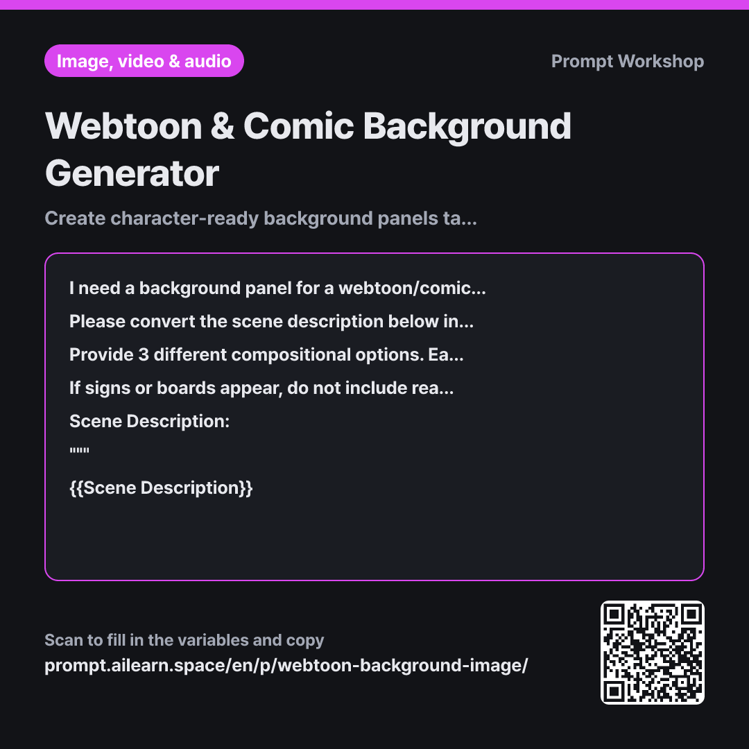
When AI-generated comic backgrounds look great but turn out unusable, it is usually because of two main reasons: a person is already standing in the middle, or the camera angle looks down from above, making pasted characters look like they are floating. The issue is not the visual quality, but the lack of room to place a character.
The Task section directly locks down two critical rules: removing all humans/animals, and fixing the camera height to the eye level of a standing character. Matching the eye level ensures that overlaid characters look naturally grounded. This is the most frequently missed requirement when using AI for comic backgrounds.
The Format section pre-divides the scene into three distinct camera distances. Webtoons typically sequence wide, medium, and close-up panels of the same location, so getting three distances at once gives you a complete scene kit for an episode. The brief layout notes below each prompt make it easy to drop directly into your storyboard.
The Constraints section preemptively strips out common AI background pitfalls. Text on signs almost always renders broken or distorted, so they are kept blank. Clearing center clutter leaves room for character art and speech bubbles. Finally, enclosing the scene description in triple quotes (""") prevents descriptive words like "worn" or "wet" from overriding the overall prompt instructions.
Unfamiliar terms? See Aha AI: prompt, output-format
Compared with a bad example
Draw a webtoon background of an alley after rain in the evening
A simple prompt like this usually yields an image with a figure holding an umbrella right in the middle of the alley. Erasing them leaves a hole on the ground that requires manual redrawing, and high-angle perspectives will clash with standard eye-level character assets.
Variations
Reusing the Same Location Across Multiple Episodes
I need to reuse the same location across multiple comic episodes with different camera angles. The location details and overall art style are as follows: {{Art Style}}. To ensure readers recognize it as the exact same space, first list the fixed environmental elements that must remain consistent regardless of camera angle (such as building layouts, wall colors, floor materials, and window designs). Then, incorporate that fixed list into 3 separate English image prompts featuring distinct camera angles. """ {{Scene Description}} """
Generating angles separately often turns the same alley into an entirely different neighborhood. Listing and locking key anchor elements first keeps the location consistent across multiple shots.
Leaving Wide Negative Space for Dialogue Bubbles
I need a comic background panel for a dialogue-heavy scene. The scene details are below and the aspect ratio is {{Aspect Ratio}}. Write an image prompt that leaves the top third of the frame clean and open with simple surfaces like empty sky, a plain wall, or soft fog to accommodate speech bubbles. Ensure the colors blend seamlessly so the negative space transitions naturally into the lower scenery. """ {{Scene Description}} """
In panels with heavy dialogue, overly detailed backgrounds make text unreadable. This prompt bakes dedicated negative space directly into the composition constraints.
Model notes
Aspect ratios are usually configured in the tool's parameter settings. Do not paste the ratio text at the very end into the prompt body; apply it directly in your tool's settings.
If you include aspect ratios directly inside prompt sentences, the AI may render numbers as visible text inside the image. Move the aspect ratio from the final line into your generation tool's native settings (e.g., --ar 16:9 in Midjourney parameters or UI selectors) and remove it from the core text prompt. For extremely tall vertical panels, always verify first whether your tool supports that ratio natively.
Related prompts
Last updated 2026-09-02 · Found a mistake? Let us know