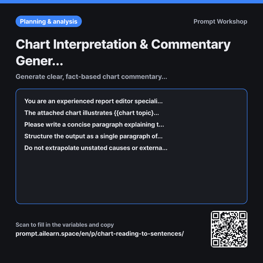
Why it is written this way
When you simply upload an image and ask "Explain this chart," AI models often speculate beyond the data. For instance, seeing a downward trend, it might add "likely due to economic downturn." Using such unchecked AI output in reports leads to awkward moments in meetings when asked, "Where did this causal insight come from?"
The Role specifies "editor" rather than "analyst" for a reason: an analyst seeks causes, while an editor accurately describes visible facts. The instruction to distinguish between visible elements and external assumptions enforces this boundary.
The second paragraph establishes Context by defining the target audience. A summary for executives needs fewer axis descriptions and upfront conclusions, while one for practitioners requires specific ranges and exceptions. The instruction to provide supporting evidence for the emphasized points ensures the AI does not just blindly echo your assertion if the chart data doesn't actually support it.
The Format constraint defines exact sentence counts and roles, guaranteeing a uniform structure across multiple charts in a report. Finally, the Constraint requiring "Needs verification" prevents hallucinated numbers from low-resolution visuals.
Unfamiliar terms? See Aha AI: context-window, hallucination
Compared with a bad example
Please write a summary explaining this chart.
(Attach chart image)
The generated paragraph may sound convincing, but it is unverifiable. Subtly misread numbers remain hidden behind smooth prose, and unsupported assumptions are blended in without clear sourcing. Without a specified audience, the tone and complexity will fluctuate inconsistently across different charts in the same report.
Variations
For Spoken Presentation Scripts
Please write a spoken presentation script explaining the attached chart about {{chart topic}}. The audience is {{target reader}}, and the allotted time for this slide is 40 seconds. Use natural, conversational language rather than formal report style. Pick at most three key numbers and describe the rest using general trends like "roughly" or "consistently." Conclude with a single sentence highlighting how {{points to emphasize}} is reflected in the chart, and do not mention unstated external causes.
Adapted for spoken delivery rather than reading. To prevent cognitive overload during a live presentation, the number of referenced data points is limited to three.
For Multiple Charts
The attached charts are all related to {{chart topic}}. Please analyze each chart and organize the findings into a table with three columns: "What it Shows", "Key Figures", and "Takeaway for {{target reader}}". Below the table, write a two-sentence summary highlighting cross-chart insights that only appear when comparing them together. If any data point is unclear from the visual, mark it as "Needs verification."
Uses a table format instead of paragraphs to allow quick scanning across multiple charts. The concluding two lines capture holistic insights easily missed when viewing visuals in isolation.
Model notes
Attach the image file first, then paste this prompt.
Image resolution heavily impacts accuracy. Upload original files or zoomed-in captures rather than small screenshots. If axis labels are small, add: "Please transcribe the axis scale and labels first before writing the commentary" to verify read accuracy beforehand.
Related prompts
Last updated 2026-09-02 · Found a mistake? Let us know